[Interface Mod] Infinity Alpha


Comments
-
Oh, holy crap. I thought this thread had been idle since post 11. Sorry I didn't respond to some of you with issues, I'll tend to those ASAP! This morning my school has late start so I can finish up the Channel Selection screen! Testing the positions in the Buddy List is the biggest pain in the ass of this project by far. Every little element is a separate tag and requires being moved. Thank God I've moved to using Notepad ++ as I can at least have some resemblance of organization. But once I can get the first User position properly placed then it's just incrementing it. But closing and starting Crossfire to refresh results is so time consuming.
BTW: There's a great new project I have planned after this, that will be incredibly useful. Because it'll require a ton of labor, I might PM a select few to give me feedback until I have a complete enough version to release. But I'm not gonna start until this bad-boy is done. -
Replies...No more black market?
If you're talking about the Black Market notifications in chat: while there are no promises, I'm expecting it to be an option in the options application.
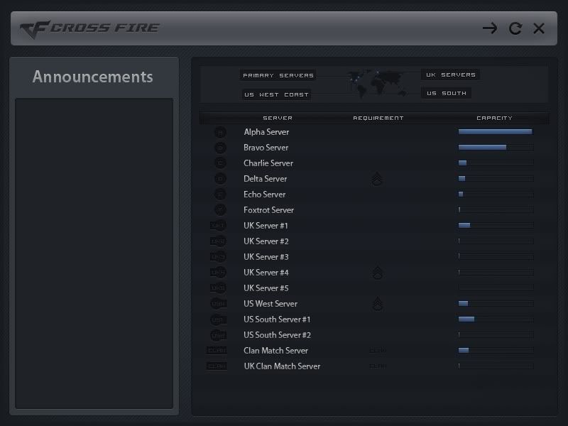
If you're talking about the button to access it, it's the Item Shop window on the left, in a unified (kinda) shop button.sdRENNERRRR wrote: »wtffffff is there a button to change it on and off LOL?
Kinda, there will be an options application that comes with it. Primarily because there are features some people like and others don't, a good example is the Repair All button, some people use and some want it gone.reddeath68 wrote: »cool but your chat select arrow is a little down u might wanna fix that script
Yeah, I haven't touched the chat scripts yet, so the positions are the same as they were before. But I appreciate you pointing that out anyways! -
First of all, sorry for the triple post :P
Next, I spent a large majority of the morning fixing the Buddy List, while the examples aren't ideal, it shows good improvements.
Chat is so incredibly close to being done-
But here's today's lovely progress:
Note:
The dots on the left side are status images. No one was on this morning so it shows everyone as being offline, which is why it's gray. Also, the days of a separate box showing your friend's location are done, now their position will be displayed on the bottom bar for a cleaner look.
Another note:
I may do a light/dark alternating background like on the server and channel selection, just to allow each user to be differentiated in addition to adding better visual effect. -
NeoSpectrum wrote: »First of all, sorry for the triple post :P
Next, I spent a large majority of the morning fixing the Buddy List, while the examples aren't ideal, it shows good improvements.
Chat is so incredibly close to being done-
But here's today's lovely progress:
Note:
The dots on the left side are status images. No one was on this morning so it shows everyone as being offline, which is why it's gray. Also, the days of a separate box showing your friend's location are done, now their position will be displayed on the bottom bar for a cleaner look.
Another note:
I may do a light/dark alternating background like on the server and channel selection, just to allow each user to be differentiated in addition to adding better visual effect.
It's me!
-
Okay, I've come across a significant problem- the clan mark's position values are no where to be found, not only is it very odd, but rather annoying. Everything is essentially done except the clan mark and I've spent the past four days troubleshooting. Until the unlikely discovery of the script or more unlikely help of a G4 Box developer comes along- it'll be misplaced.
-
NeoSpectrum wrote: »First of all, sorry for the triple post :P
Next, I spent a large majority of the morning fixing the Buddy List, while the examples aren't ideal, it shows good improvements.
Chat is so incredibly close to being done-
But here's today's lovely progress:
Note:
The dots on the left side are status images. No one was on this morning so it shows everyone as being offline, which is why it's gray. Also, the days of a separate box showing your friend's location are done, now their position will be displayed on the bottom bar for a cleaner look.
Another note:
I may do a light/dark alternating background like on the server and channel selection, just to allow each user to be differentiated in addition to adding better visual effect.It's me!
And me!
But it's old :[


This discussion has been closed.
Categories
- All Categories
- Z8Games
- Off-Topic - Go To Game OT Forums
- 1 Z8 Forum Discussion & Suggestions
- 16 Z8Games Announcements
- Rules & Conduct
- 5.5K CrossFire
- 1.1K CrossFire Announcements
- 1.1K Previous Announcements
- 2 Previous Patch Notes
- 1.4K Community
- 124 Modes
- 646 Suggestions
- 86 Clan Discussion and Recruitment
- 277 CF Competitive Forum
- 19 CFCL
- 26 Looking for a Team?
- 761 CrossFire Support
- 64 Suggestion
- 127 Bugs
- 30 CrossFire Guides
- 178 Technical Issues
- 49 CrossFire Off Topic