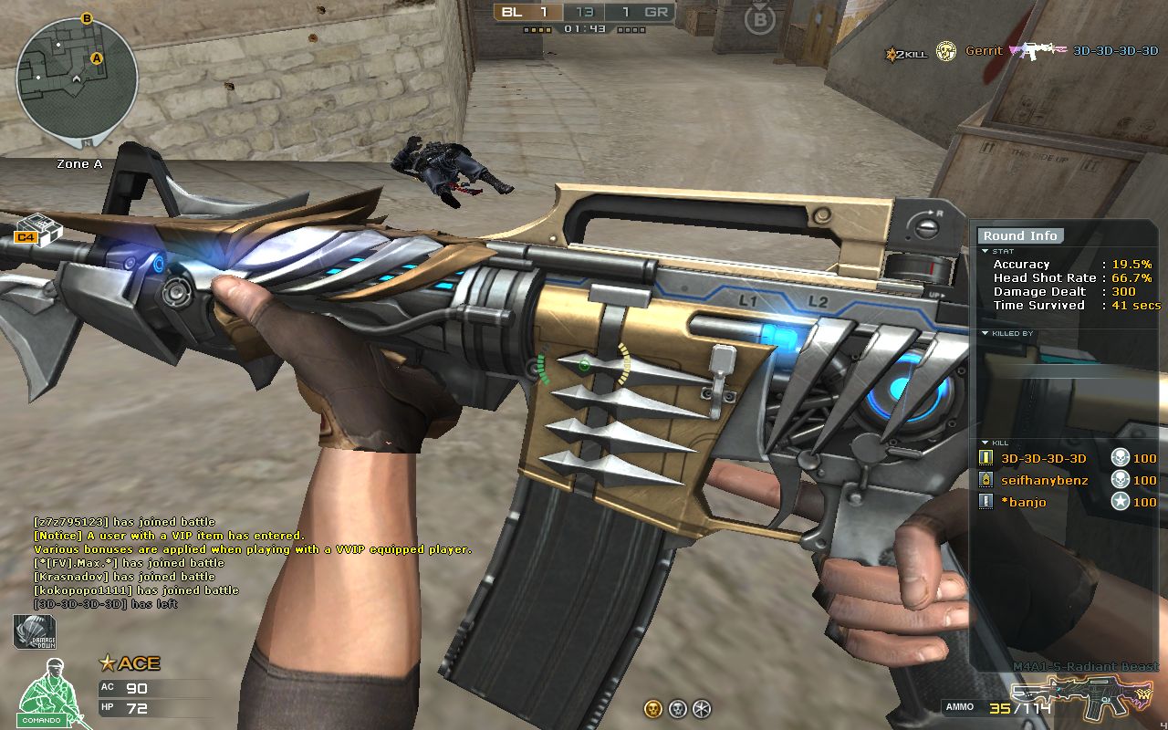
Radiant Redesign: July 5th - July 9th
Comments
-
So much for creativity.. -_-HEYIMPATRICK wrote: »Please dont get me wrong.
I am happy for those who won, but it feels like you just can add a few colors and be like here u go and u can win. Some people would actually add colors to give it a theme a match, to make it stand out. It sorta feel like you guys picked some people and went whatever. Like I spent time making my m4 and tried to give it a nice touch. (I am not saying I should win) but it honestly just feel like you can pick 2-3 colors or make it full black and win.
Sorry I guessBrandyIncubo wrote: »I expected to see a beautiful combination of colors..If those are the best entries...I wonder how the others were ._.claire9822 wrote: »I personally don't like some of them, and think they would of been better designs, but we couldn't see everyone's entry to judge that. Congratz to the winners anyhow!I have much to say about the winning designs but i personally don't like them and feel like simple designs like that shouldnt have won but its whatever congrats to the "lucky" ones that been chosen lets hope we dont see events based on GM's taste over screenshots and maybe post the ones you think they are the best and let yhr community vote on them thats all i have to say.I think there are alot of better design of those
how can those be the winners its weirdI agree ill try to post my ss here if i know how to do it lol plus your signature says it all ��This is my submitted screenshot i think it looks much better than the winning ones see it and see by your selves if im posting it thhe right way
http://imgur.com/Gwth30y
Get over it. -
-
-
To those of you complaining, it was always stated from the very start that the GM's would pick their 5 favourites. We narrowed it down from a list of over 150 to a list of 50, then voted further on that on our top 5. The choices were scattered across the board, but the 5 you now see are the 5 that were chosen. To answer a few questions:
-No you didn't have to have the first person view. The shot just had to be in game and show the weapon. Most submissions used the inspect feature but it was not a requirement.
-Yes, some of these may appear 'plain'. But it is clearly a general consensus amongst the team that designs with a 'theme' or something that 'matches' were liked better than those that looked like they had been randomly chosen from a bunch of different colors.
-No, I don't want to see people arguing over this because the winners are chosen and thats that.
You are all absolutely entitled to your opinions. However, your opinions do not influence this event. Thank you to all who participated, and congrats again to the winners
This discussion has been closed.
Categories
- All Categories
- Z8Games
- 1 Z8 Forum Discussion & Suggestions
- 15 Z8Games Announcements
- Rules & Conduct
- 2.5K CrossFire
- 736 CrossFire Announcements
- 730 Previous Announcements
- 2 Previous Patch Notes
- 333 Community
- 12 Modes
- 397 Suggestions
- 16 Clan Discussion and Recruitment
- 89 CF Competitive Forum
- 1 CFCL
- 17 Looking for a Team?
- 530 CrossFire Support
- 8 Suggestion
- 15 CrossFire Guides
- 38 CrossFire Off Topic

